
.svg)
Problem: The Kahua Support team lacked proper visualization into data on key aspects of their process. These included the volume of tickets per application category and the number of Service Level Agreement (SLA) response and resolution violations over time.
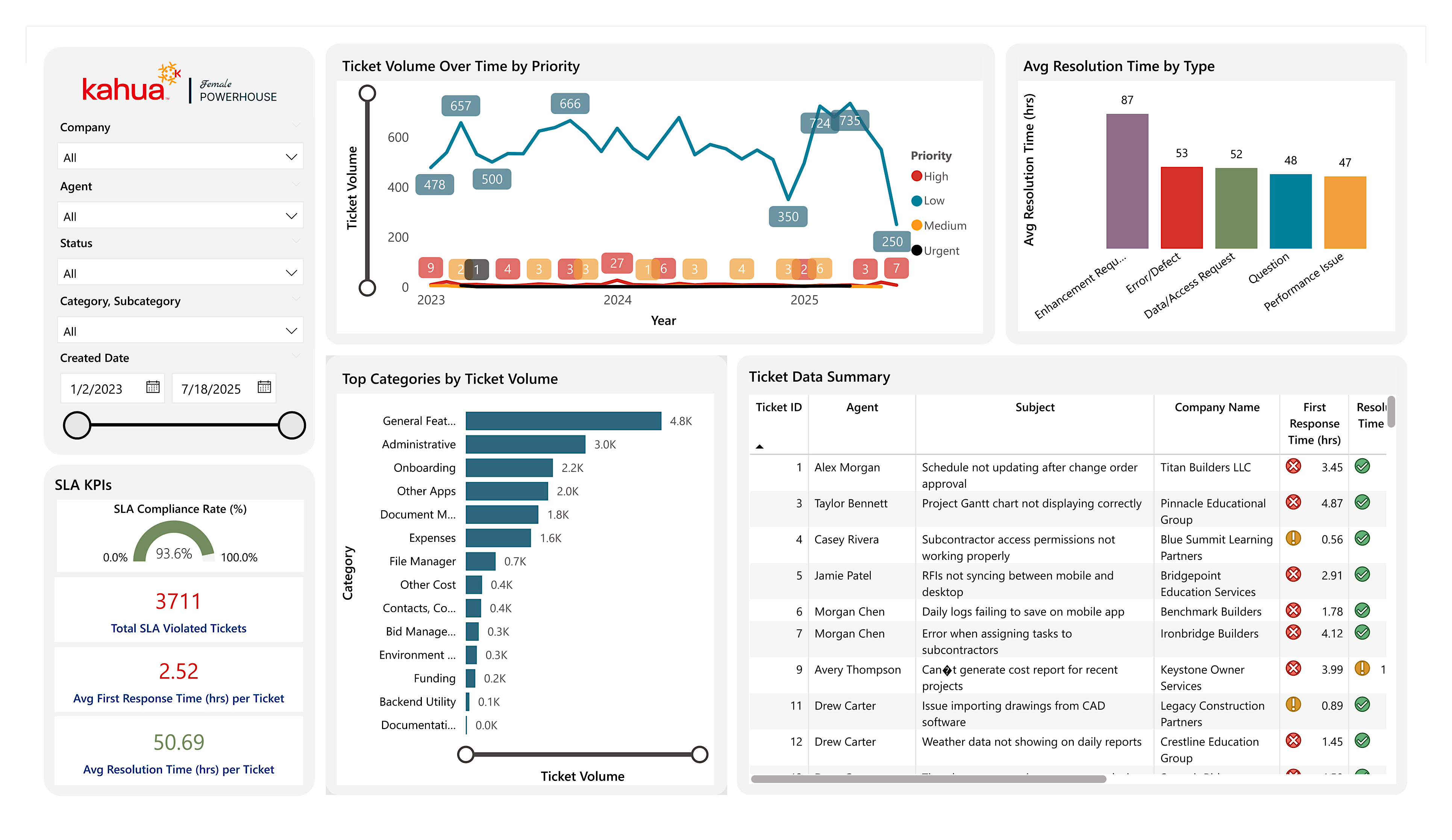
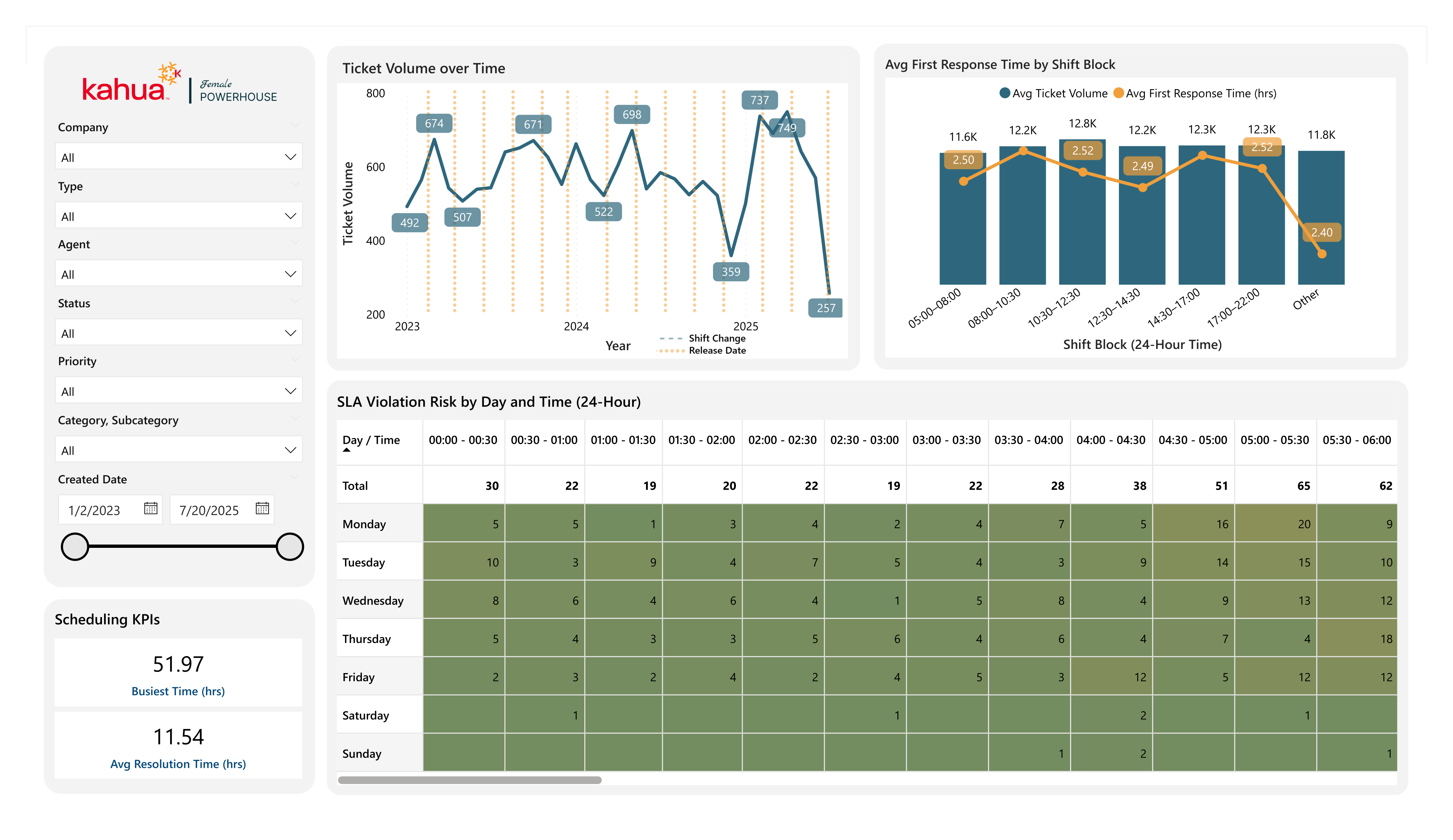
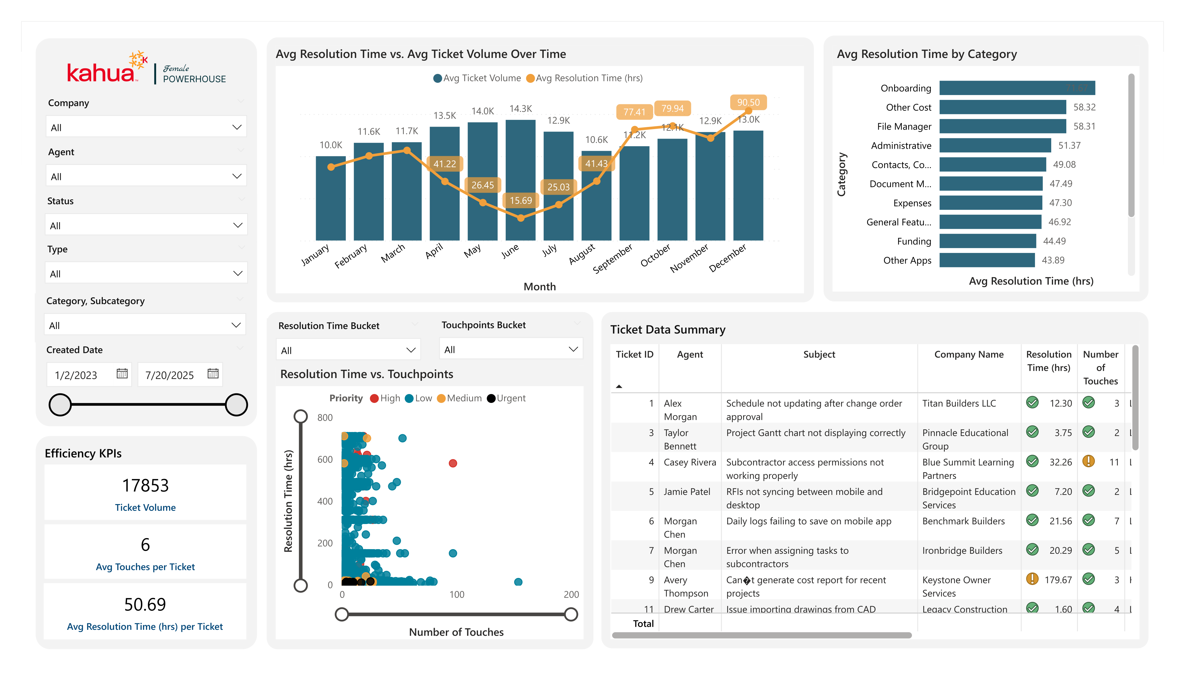
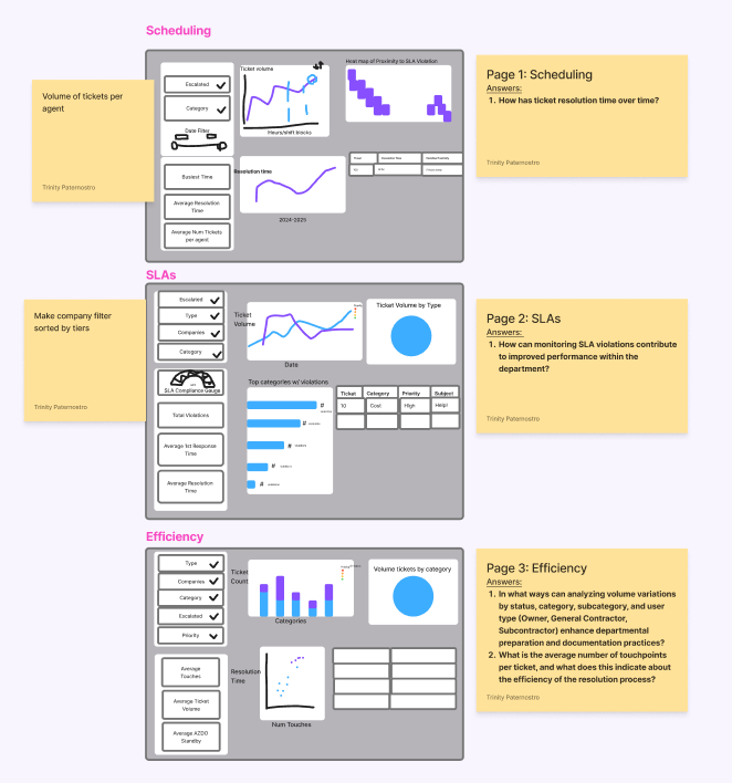
Solution: Using data from interviews with four members of support, my team and I built out a comprehensive dashboard. With multiple pages, each built around a central research question, we investigated relationships between resolution times and ticket type, categories and ticket volume, and the influx of tickets over the past three years. This allows the Support team to measure the effectiveness of their current approach and make a case for improvements across the company (such as enhanced documentation and support materials).
.svg)
We divided our project into four phases:
These are explained in detail below.
Throughout this project we used the ETL (extract, transform, load) process to pull and display our data. In addition, we conducted loosely structured interviews with key stakeholders. We wanted our stakeholders to be able to not only easily comprehend and use our dashboards, but to gain valuable information from them. These interviews served as the foundation of our project and informed our design and development decisions.
The research phase was by far the largest in this effort, making up more than half of our time working on the project.
We began by conducting introductory research on our own. Then, we met with multiple members of support and posed questions such as those listed below.
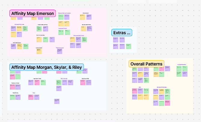
After our interviews we created an affinity map of our meeting notes in order to uncover key patterns. We discovered that the support team was interested in delving into...
With this knowledge, we paired down our research questions to the following four.
With the intent of creating the maximum three pages, we began the next phase: extracting, transforming, and analyzing the data and mocking up our dashboards.
As Jennifer transformed the data, we began sketching mockups.
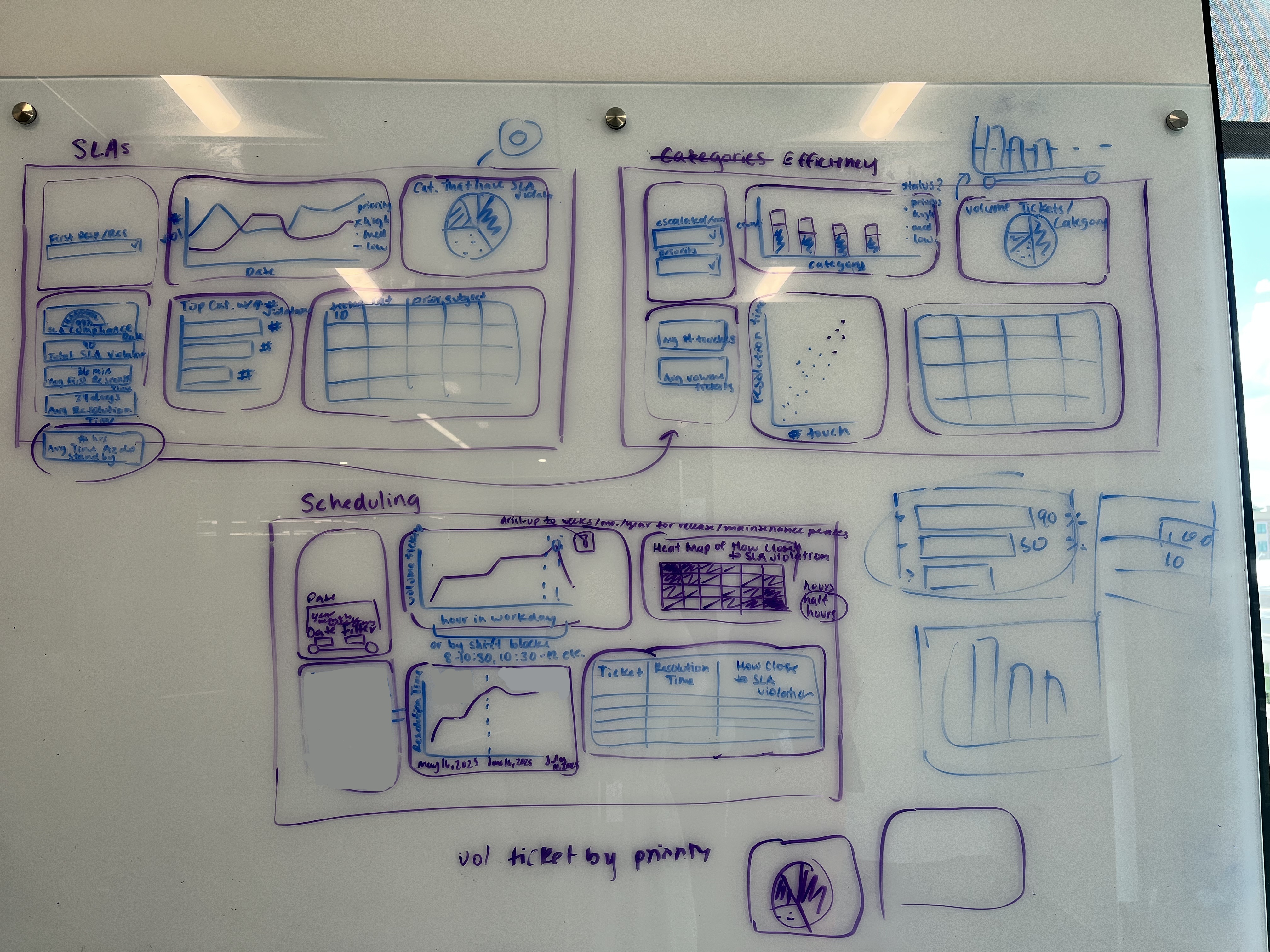
We accounted for space on the page, volume of data, usability, and visual appeal when choosing our graphs and tables. We aimed to present the data in a way that directly answered our research questions, thus meeting the Support team’s needs to the best of our ability.
Once we agreed on the layout of our dashboards, we scheduled a follow-up meeting with members of the support team we had previously interviewed. With their feedback in mind, we made changes to what visuals we utilized and how we presented the data. Then, we were ready to start developing.
The development phase was our last and fastest phase. To stay consistent and grounded, we continued asking the Support team for clarification of the support process. As we gained more knowledge, we updated our design to ensure we answered our research questions and portrayed the data in unique, helpful, and readable ways.
Finally, we met with our advisor for final feedback before submitting our dashboards. Taking her thoughts into consideration, we changed a few visuals and added some filters for further clarity.
The competition judges applauded the visual design and usability of our dashboards. However, it was the foundation of research that impressed them the most. This was a primary factor in our award of first place.
Interviews with stakeholders kept our vision aligned with our users’ goals and points of view throughout the process. Feedback from our advisor offered a view into the conventions of making data presentable and comprehensible. Thus, we could not only start strong, but continue to improve our product along the way.