
.svg)

Problem: The goal of this project was to apply the core UX/UI design principles I learned in Prototyping II. After researching mobile design conventions and existing products, I chose to construct a weather app. While not driven by formal user research, I aimed to design a clean, consistent, and accessible interface to minimize cognitive load. To this end, my efforts were centered on creating design systems, consistent layouts, and complex interactions to simulate a real-world product experience.
Solution: I developed Cirrius — a mobile weather app designed for iPhone 16. Featuring a component-based design system, accessible typography, and personalized user settings such as light/dark mode and temperature unit toggles, Cirrius aims to provide a smooth, effortless experience. I used an 8-point grid, reusable components, and Figma’s advanced prototyping tools to create cohesion, scalability, and regularity. Hence, confusion and the burden of fumbling through an interface is alleviated. Through the creation of Cirrius, I demonstrated my ability to design with structure, accessibility, and interactivity in mind — even without direct user input.
.png)
.png)
I derived inspiration for Cirrius from the sleek, easily navigatable interfaces of popular weather apps like The Weather Channel. I sought to emulate the following features discovered in my casual competitive analysis:
With these points in mind, I designed seven unique screens for Cirrius, three of which are onboarding. I used a soft 8-point grid system to guide my placement of elements. This layout maintains consistency by ensuring elements are aligned harmoniously. Hence, the app is visually balanced and easy to navigate.
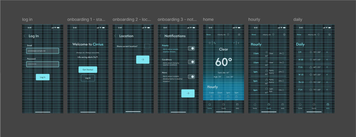
To further cement this consistency, I utilized variables, styles, and components to make a comprehensive design system. The use of these tools ensures the scalability of the app, as well as making it adaptable to design updates or changes. Key features include a choice between light and dark modes and temperature units that can be toggled between Celsius and Fahrenheit. Thus, users are provided flexibility in their interaction with the app.
These facets are discussed in greater detail in the sections below.
To build a sleek, modern design system with differing modes, I used variables. Variables allow for the standardization and reuse of values such as color, spacing, and corner radii. This way, the design is cohesive throughout, giving the user a consistent and predictable experience. They also offer the designer improved control over the scalability of the design. Should the design need to be used in a different breakpoint, with a different color scheme, these values need only be changed in one, central location for them to update across the entire prototype.
To start, I constructed a collection of primitives. These raw values consisted of neutral colors, brand colors, spacing measurements, and corner radii. The creation of primitives allows for aliasing — a method of organization where one variable (or token) takes on the same value as another. This gives the designer the ability to fine-tune, as well as scale, the design as needed, only changing one token’s value. Additionally, a single primitive value may be assigned to multiple different tokens. Hence, comforting cohesiveness is maintained across the app.
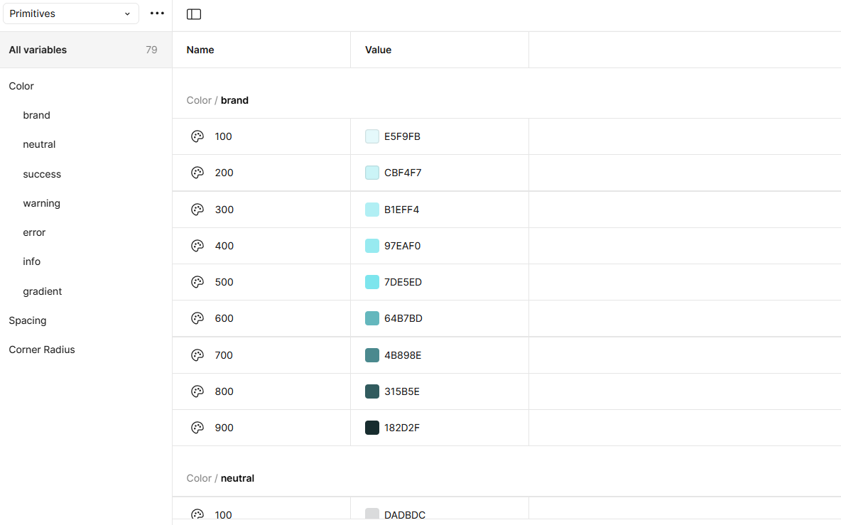
For my color values, I created a value scale of 100-900, adjusting the hue, saturation, and brightness as needed. Having this range of distinct colors ensures my design is not only aesthetically pleasing and consistent, but has ample contrast for readability. Using the Contrast plugin, I verified that all color combinations adhered to WCAG 2.1 accessibility standards, ensuring the design was at least AA compliant. This way I could be confident in its accessibility.
For the spacing and corner radii, I calculated multiples of eight. As with the 8-point grid, it is important for designers to measure padding, margins, and line height in multiples of eight. This ensures the handoff to developers is smooth. When the prototype measures are identical to those in the code, the developed product will retain the careful element placement the designer implemented.
Once my Primitives collection was complete, I created collections for Color, Spacing, and Corner Radius Tokens.
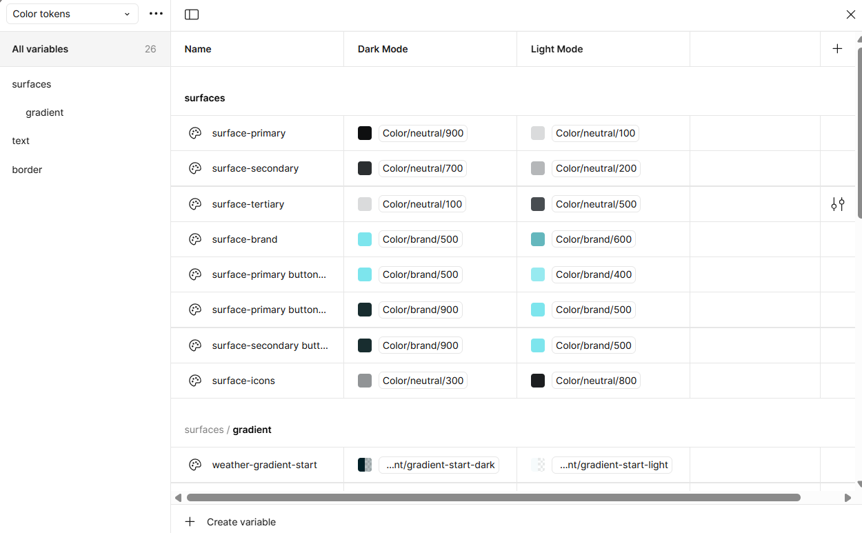
I divided the Colors Collection into the following categories:
The creation of these collections allowed for finer control of the associated values, as well as further cohesion across the design. The values are not only easily viewed by collaborators, but can be reused or tweaked as necessary.
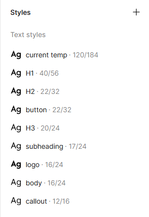
I also created a Typography collection. This held the font families for any text I planned to use. Additionally, it included font weight, font size, and line height. I determined the proper sizing through research regarding guidelines on the scale of mobile typography. Following conventions, I ensured each line height was 1.5x's its font size. This ensures that my content is clear and readable.
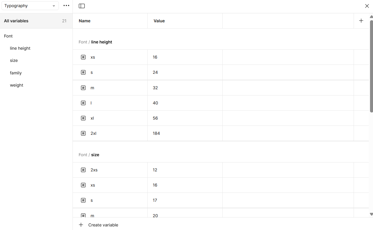
Because Figma currently lacks the ability to create typography tokens, I assigned my typography variables to Styles. I created H1-H3 headers, body/paragraph text, and special text for the current weather. Each of these was assigned the appropriate variable value for font family, size, line height, and weight. I utilized these throughout my design to maintain continuous consistency. This way users can move smoothly through the app, without being unpleasantly surprised by disjointed elements or inaccessible typography.
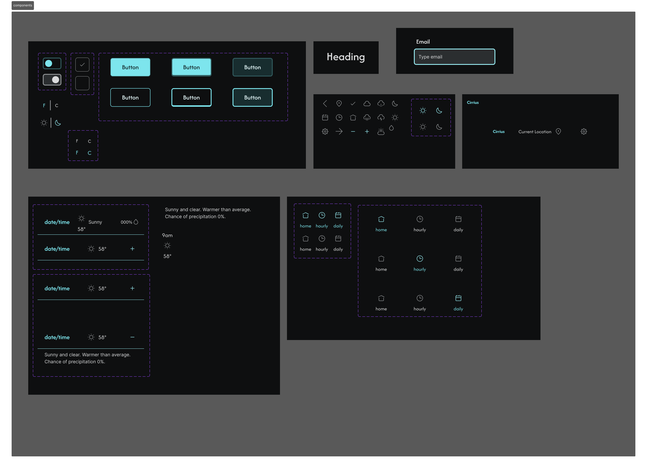
Another tool I used to maintain consistency across the design was components. By creating reusable elements (such as buttons, icons, and navigation bars), I ensured that changes could be made efficiently without introducing inconsistencies.
For dynamic elements like the tab bar and temperature units toggle (Celsius/Fahrenheit), I used variants. This allowed the app to reflect different states and interactions while maintaining visual consistency. Hence, task redundancy is reduced, errors are decreased, and the content is uniform.
I also leveraged component properties to bring to life complex interactions. Using text, variant, and boolean properties allowed such functions as the toggle between light and dark modes. By prototyping these behaviors, I ensured users would experience seamless transitions, enhancing the app’s interactivity and usability.
Interactive variables possess a power beyond mere hover or click interactions. They allow algebraic input for conversions and math problems, as well as control over specific color and element transformations within specific frames. Hence, interactions are made realistic — an invaluable resource for demos and usability studies. Thus, I sought to further my mastery and understanding of these.
When building Cirrius I used interactive variables to do two things:
Harnessing the capabilities of number and boolean variables, I brought these controls to life. If future usability studies are done on this prototype, these interactions will be powerful aids in allowing users to experience the app as they would in the real world. Thus, deeper feedback can be gained, cutting to the root of problems.
Cirrius Weather app was a project focused on applying core UX principles such as consistency, accessibility, and interactivity to create an intuitive and user-friendly design. Through careful application of variables, components, and advanced prototyping, I was able to create a scalable, cohesive, and usable app. This project — and Prototyping II as a whole — has reinforced my understanding of core UX design principles, helping me refine my skills and deepen my knowledge of creating user-centered digital experiences.